


Branding for L Plus Studio
Freelance Project
About the project
-
Brief
Design a logo for a photography studio: L Plus Photography.
-
Who is L Plus?
L Plus is a professional photography studio based in Glebe, Sydney. Its main services include portraits and product photography.
-
What does L Plus want?
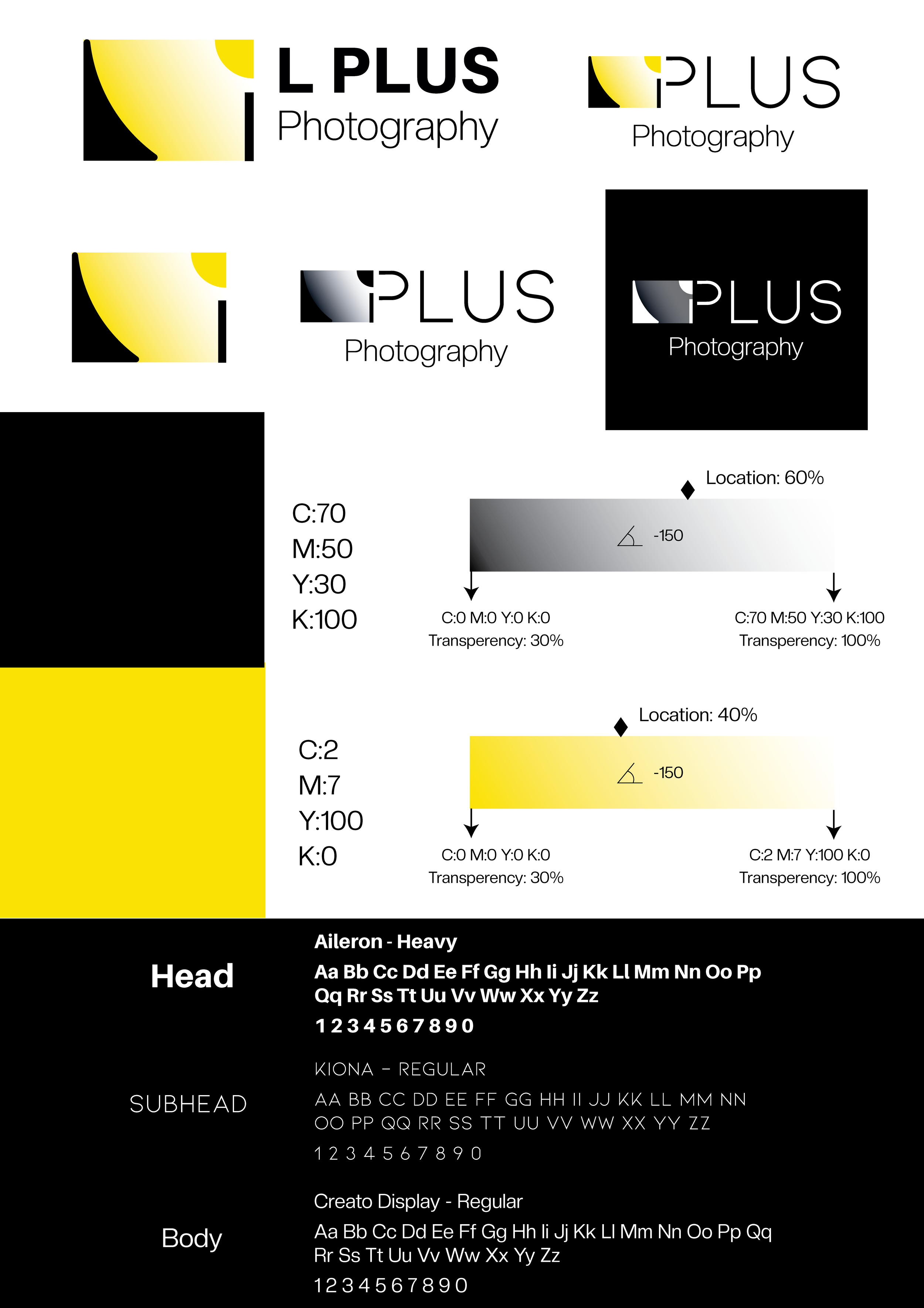
–The new logo needs to have a gradient element.
–The client would like to communicate a professional and high quality feeling through the brand.


Horizontal logo
Iconic logo
Design rationale
The logo is built on the shape of a CYC wall and light. A CYC wall is a typical interior element in a photography studio, while light plays a crucial role in a successful photoshoot.
Mini Style Guide

Shop sign mockup. (Mockup from Freepik)

Business card mockup. (Mockup from Freepik)

Original concept and development
Based on the concept of using CYC wall and light, , four sketches have been provided, and the client picked the fourth one.
The yellow colour is similar to Nikon’s, as the photographer has a special love of Nikon lenses and cameras. Bright yellow communicates a sense of warmth and energy, as well as happiness, hope and fun as a contrast to the professional and serious feeling conveyed by black and white.

Development 1

original concepts

Develop2
-
![]()
Thanks for reading!
If you would like to share your views or make an enquiry, please click on the button below
-
![]()
Journale
TV channel branding (Student project)
-
![]()
Yogiup
Sports frink branding (Student Project)
-
![]()
Behere beer
Liquor branding (Student Project)
-
![]()
IFS
Financial company branding (Freelance project)
-
![]()
Marsden High School
High school rebranding (Student Project)
-
![]()
BMW R 1250 R
Illustration (Student Project)
-
![]()
Playing card design
Illustration (Student Project)
-
![]()
Parent
E-magazine design (Student Project)
-
![]()
Portrait of Jin Xing
Magazine cover design (Student Project)


